Description.
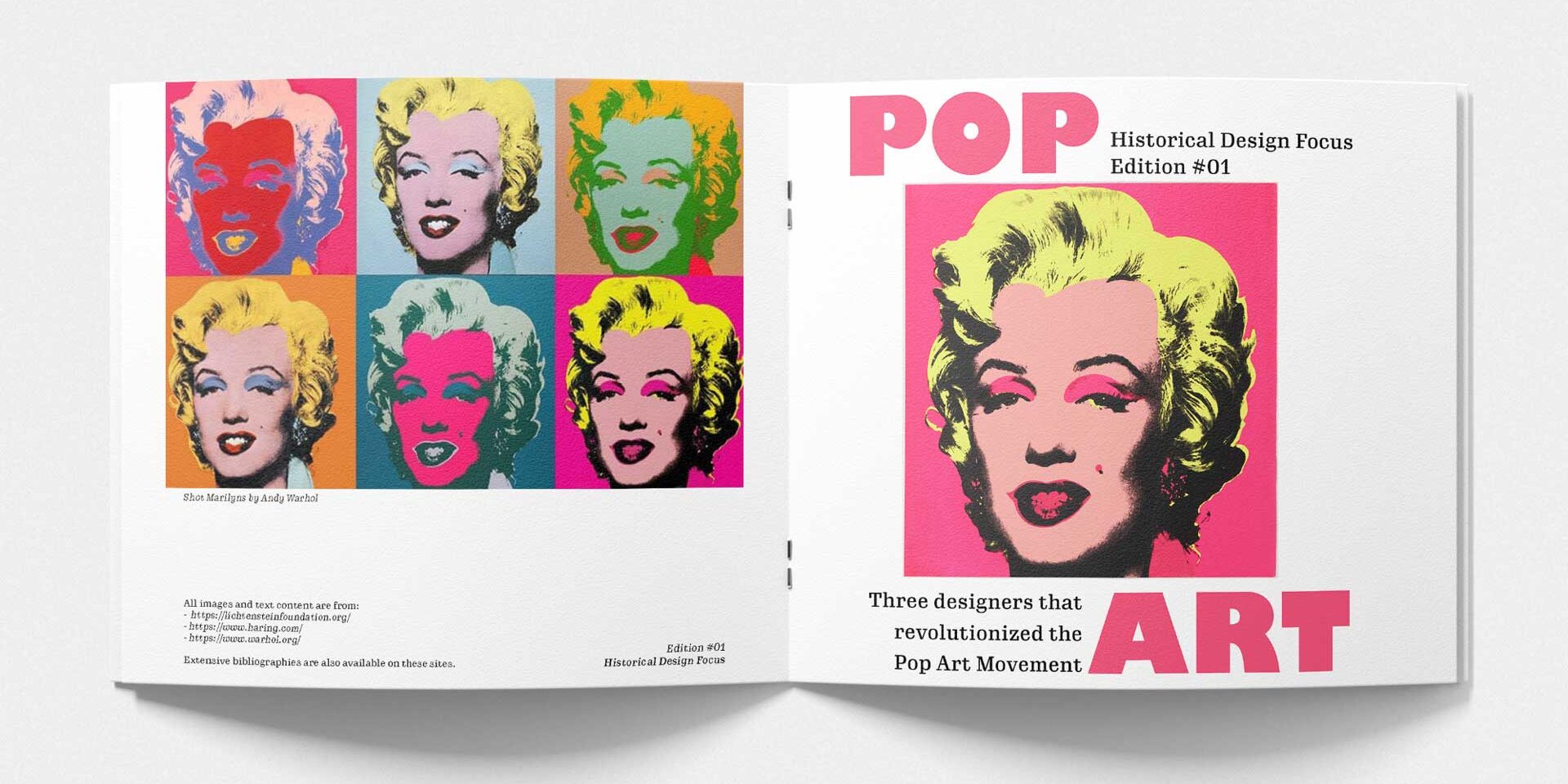
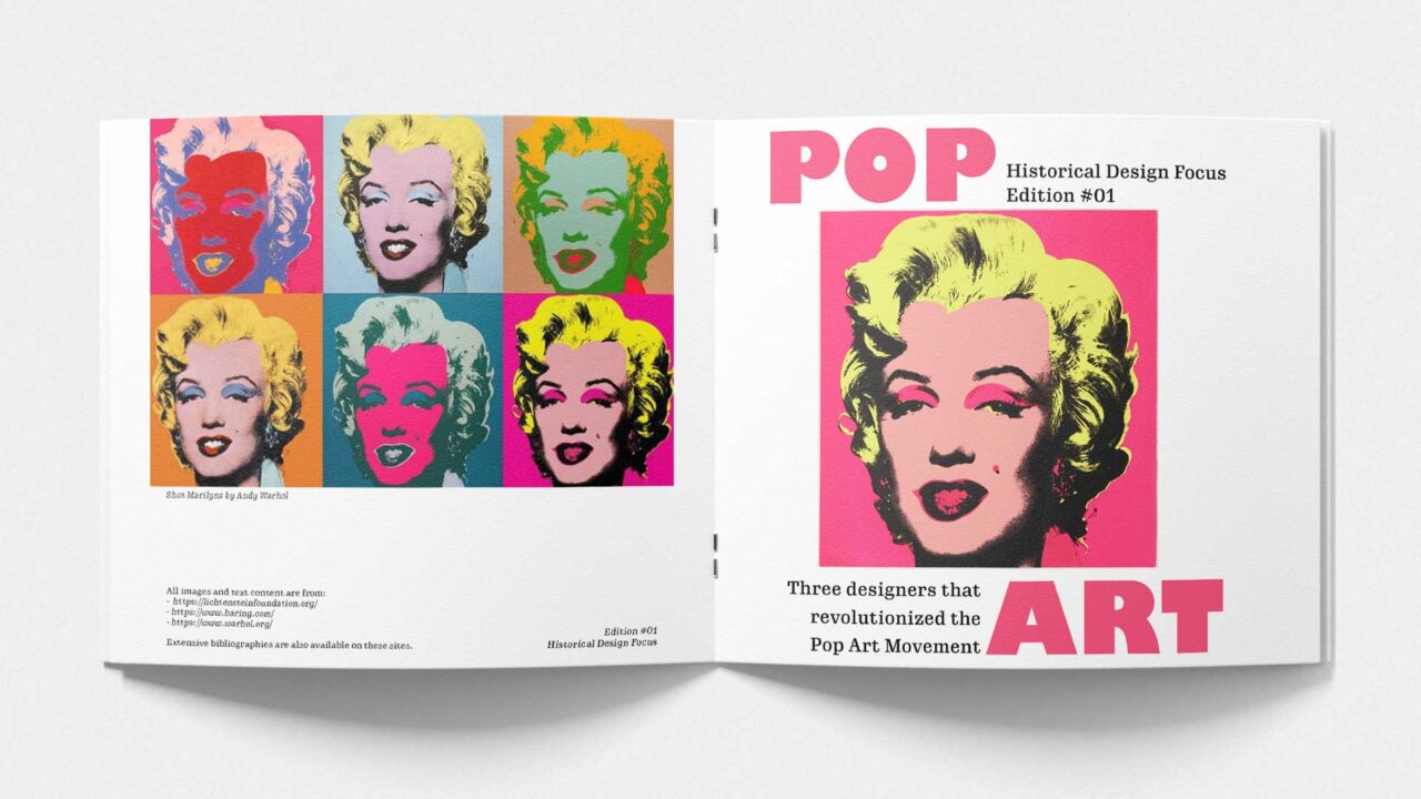
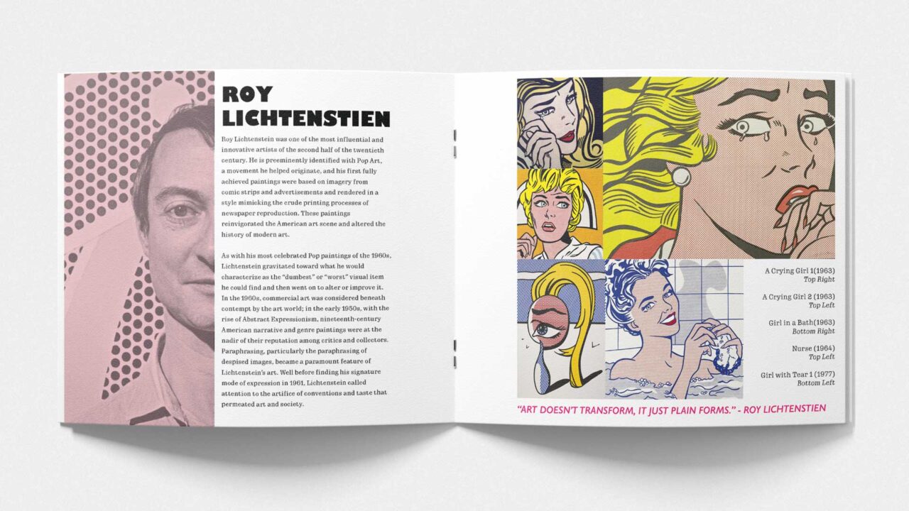
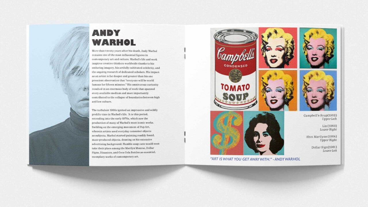
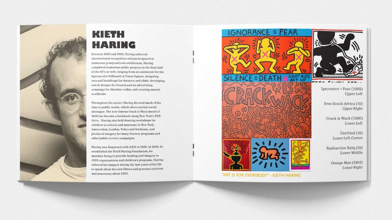
For this booklet’s design, I centered around the Pop Art movement, basing the design around striking layouts and bold fonts. For each artist page, I focused on a bold half-cut layout highlighting individualism and boldness. I utilized the font Gill Sans for its heavy and bold character, with the secondary font Gimlet Micro Narrow being as funky as it is functional, reminiscent of the pop art movement as a whole. Bold colors draw the reader’s attention to headings and important information like quotations.
Pop Art looks out into the world. It doesn't look like a painting of something, it looks like the thing itself.

